The welcome that came with homework
As seen on Growth.Design

Great signup. Then homework.
READ IN 8 SECONDS
- PROBLEM
- The signup is lovely. Then it ends with a pop-up in the corner, a welcome card and eight guides to read.
- DECISION
- Fold the last two steps into one. Ask for email links where the pop-up appears, and send one guide a day.
- RESULT
- A redesign on paper: two end steps become one, and eight guides turn into eight short emails, one a day.
THAT'S IT. OR KEEP SCROLLING ↓
10 slides · ← → to move · swipe on phones
-
READ IN 8 SECONDS
- PROBLEM
- The signup is lovely. Then it ends with a pop-up in the corner, a welcome card and eight guides to read.
- DECISION
- Fold the last two steps into one. Ask for email links where the pop-up appears, and send one guide a day.
- RESULT
- A redesign on paper: two end steps become one, and eight guides turn into eight short emails, one a day.
THAT'S IT. OR KEEP SCROLLING ↓
As seen on Growth.Design
tap right for next · tap left to go back
-
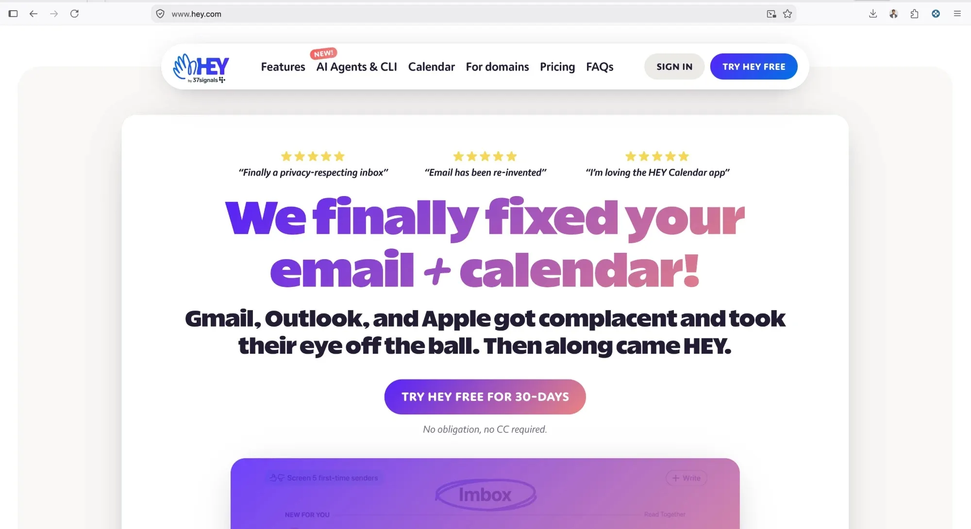
HEY had me at the headline: "We finally fixed your email + calendar!" The next line picks a fight with Gmail, Outlook and Apple. Bold. It works.
-
Signup asks one thing at a time, and the password comes last. By then you've already picked your @hey.com address, so you're filling it in for something you own.

-
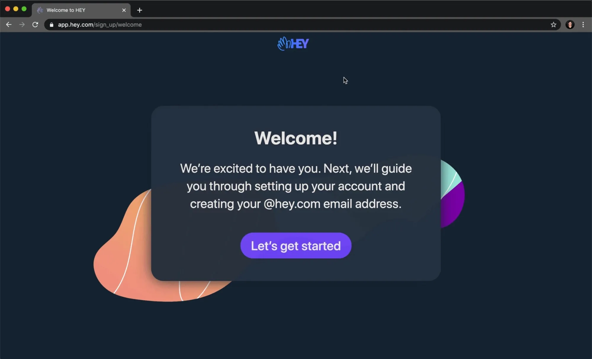
Then it gets wordy.
- Welcome card · 46 words
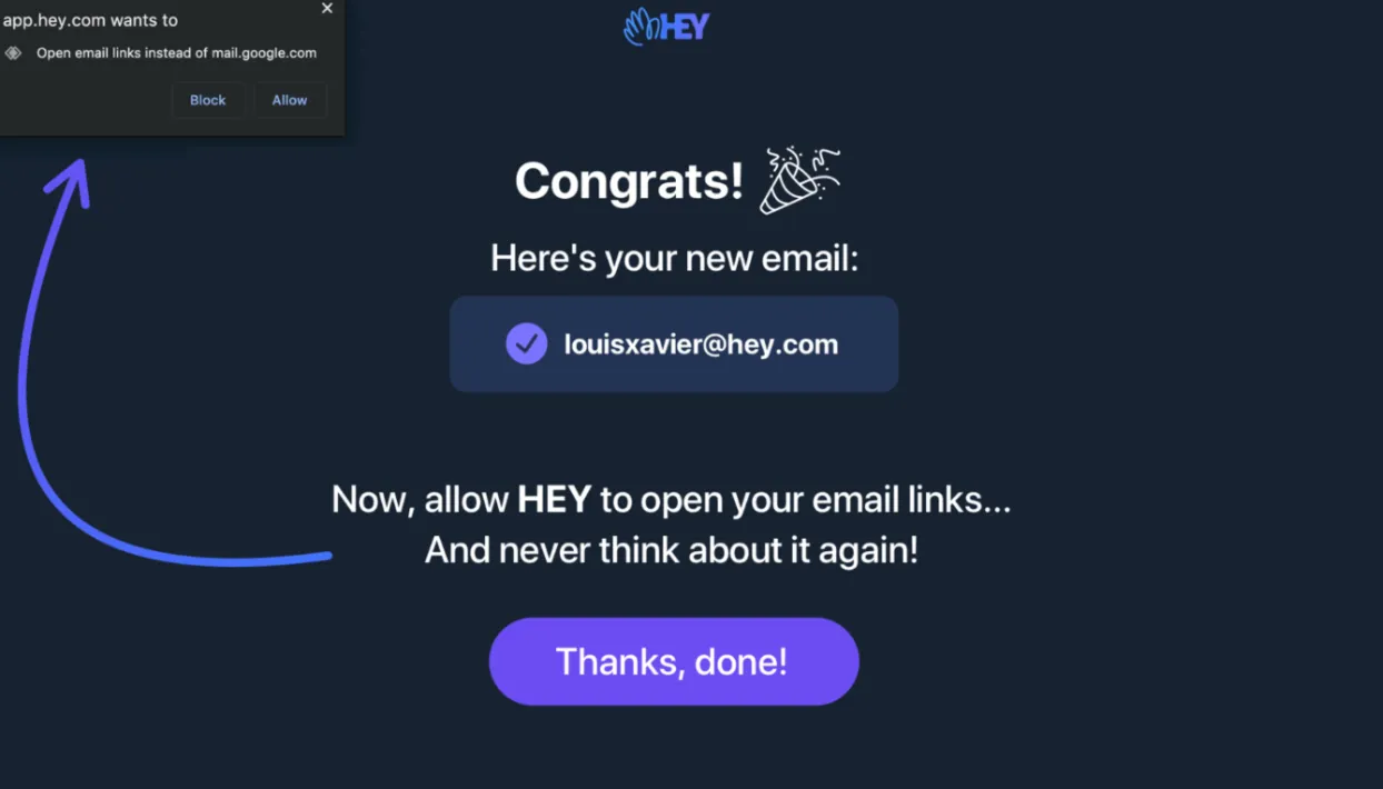
- Congrats · allow email links? · Thanks, done!
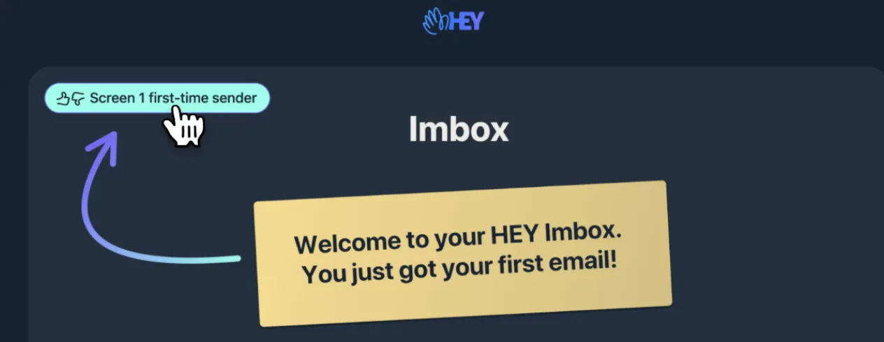
- Imbox · 8 guides
The pop-up appears in the top corner. The words asking you to click it sit in the middle. Easy to miss both.

-
Your turn
Someone just got a brand-new email address. What do you show them next?
Pick one before you scroll.
- A. Ask them to let HEY open email linksB. Eight guides to readC. Their Imbox, with the ask built in my pick
C. Open the Imbox with their first email already there, and point at the browser's pop-up from the same screen. One screen instead of two.
Principle 01
Ask when it pays off
People say yes to a permission right after they get something, and right next to the thing it helps.
-
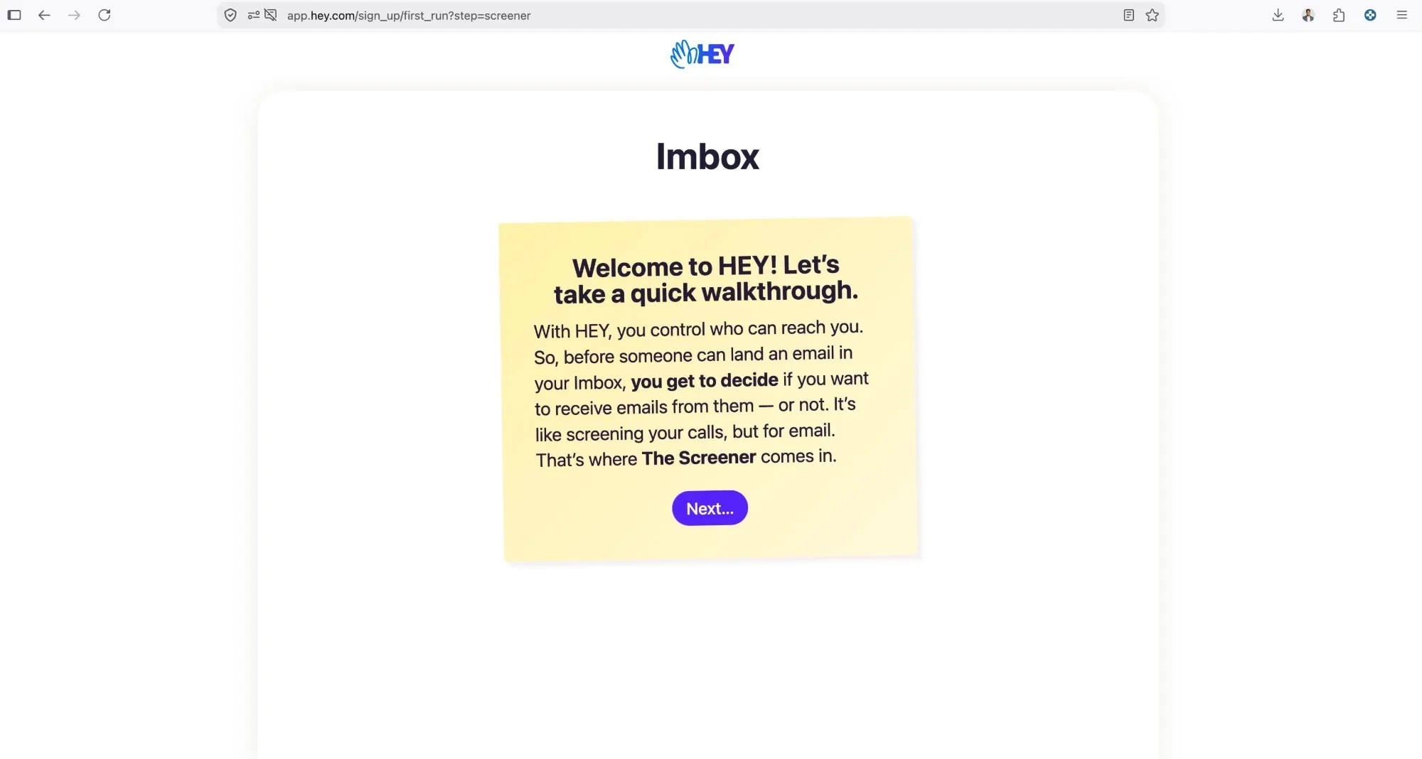
Before a single email has arrived, a 46-word card explains how to screen them. I read it once. I wouldn't read it twice.

-
Then the Imbox: eight emails from the HEY team, and every one is a manual. They explain features far from where the features live. That's a lot of homework for day one.

-
Guess the number
GUESS THE NUMBER
- YOU GUESSED
- 2
- ACTUAL
- 8
- OFF BY
- 6
Go on, guess. Nobody's watching.
-
2 → 1
steps at the end of signup. Then one guide a day for eight days, so there's always a reason to come back tomorrow.
-
RECEIPT · HEY ONBOARDING
- STEPS AT THE END
- 2 → 1
- EMAIL-LINKS ASK
- IN CONTEXT
- GUIDES ON DAY ONE
- 8 → 1
- SCREENS REDESIGNED
- 2
- STATUS
- PROPOSAL
A REDESIGN, NOT A RELEASE
Great product. The welcome needs a diet.
The receipt
Everything this file changed, on one slip.
What I'd do next
Put the one-screen ending in front of five new signups and count who clicks Allow.
RECEIPT · HEY ONBOARDING
- STEPS AT THE END
- 2 → 1
- EMAIL-LINKS ASK
- IN CONTEXT
- GUIDES ON DAY ONE
- 8 → 1
- SCREENS REDESIGNED
- 2
- STATUS
- PROPOSAL
A REDESIGN, NOT A RELEASE